1964-Early 70s
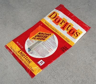
Packaging consists of:
- The word "Doritos" in yellow and orange squares with the word "BRAND" in small text below the "s". The logo has a Registered trademark "(R)" symbol.
- "Nacho Cheese Flavor Tortilla Chips" in a yellow rectangle.
- A quarter sliced cheese with "NACHO CHEESE FLAVOR" on it. Next to it is a white outlined circle with a negative space showing the chips. The bag pictured above is empty and ironed flat so it shows the back of the bag.
- "NET WT 5 1/2 OZ" in white on the bottom left of the circle.
- The Frito Lay logo, a stylized lowercase "f" and an uppercase "L" in a white box, on the bottom right of the circle.
Early 70s-Mid 80s
Template:Missing logoTemplate:Missing former logo
Mid 80s-Early 90s
Early/Mid 2000s
")
Canadain Doritos bag w/ Toy Story promotion.
2000-2010
2010-2012
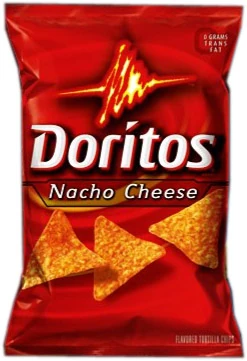
Packaging consists of:
- A red background with spinning yellow lines.
- The logo being a red-yellow zig zag line and "Doritos" with the "i" dotted with a triangle.
- "Nacho Cheese" in a black rectangle.
- Three of the chips in their usual triangle shape.
- A black faded "0" and "0 GRAMS TRANS FAT" in white.
- "FLAVORED TORTILLA CHIPS" on the bottom left.
- "NET WT 12 OZ (340.2 g)" on the bottom right.
Variants:
- 2005: "NEW LOOK, SAME GREAT TASTE" is placed on the top left. "NACHO CHEESE" and all the other flavor names were in uppercase letters and there were two chips instead of three. "FLAVORED TORTILLA CHIPS" was placed on he bottom left.
- 2006: The bags had "Nacho Cheese" like the standard pakaging.
- 2007: The packaging finally has three chips.
- 1 oz. serving bags don't have the chips.
2012-present
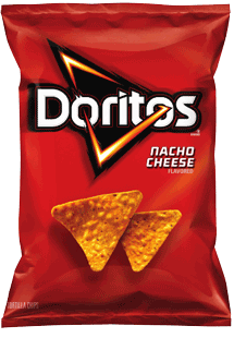
Packaging consists of:
- The logo is a red-yellow triangle and "Doritos" in a font that looks like the one from before.
- "NACHO CHEESE" next to it.
- Two of the chips.
- The caption on the bottom left is "TORTILLA CHIPS".